| THE AWARD |
| CATEGORIES |
| REGISTRATION |
| SUBMIT YOUR WORK |
| ENTRY INSTRUCTIONS |
| TERMS & CONDITIONS |
| PUBLICATIONS |
| DATES & FEES |
| METHODOLOGY |
| CONTACT |
| WINNERS |
| PRESS ROOM |
| GET INVOLVED |
| DESIGN PRIZE |
| DESIGN STORE |
| THE AWARD | JURY | CATEGORIES | REGISTRATION | PRESS | WINNERS | PUBLICATIONS | ENTRY INSTRUCTIONS |
Ttmm For Pebble Watchfaces Apps by Albert Salamon |
Home > Winners > Design #57428 >Interview |
 |
|
FS: What is the main principle, idea and inspiration behind your design?
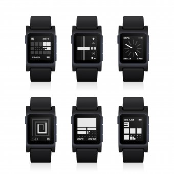
AS: Readability and Style. Pebble smartwatches use low resolution (144x168 px) e-ink displays which in daylight make graphic perfectly clear, but in medium light cotrast is very low. To balance these two completely different way of showing time I design simple and clear graphic with rather large visual elements and digits.
FS: What has been your main focus in designing this work? Especially what did you want to achieve?
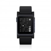
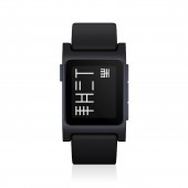
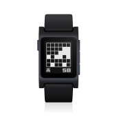
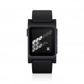
AS: New forms of time. I experimented with new abstract ways of showing four digits of time. There is PLAITTMM with a new font where every element in digit counts, so 1, 2, 3 are light digits and 7, 8, 9 are dense. In other models I wanted to express metaphor that life is precious and means something. MOMENTTMM is new way to see time passing by - unpredicted change in endless combination pointing for you something unique which last only for a moment like luck or love, and in CELLTTMM time is in a cage of grid eats nothing and grows so that each hour can count. TTMMFALG shows how "wind of the TIME" blows. TTMMAZE reveal the maze of the time and TTMMSTRING is kind of time instrument where hours are strings.
FS: What are your future plans for this award winning design?
AS: I am going to find partner or investor to design and produce TTMM hardware watch. If you are interested let me know.
FS: How long did it take you to design this particular concept?
AS: This project took two years. I have spent a lot of time learning e-ink screen technology and finding the best colors combinations, optimal size of typography and graphic elements. Basically, design ideas come very fast to me, documentation takes one or two days. Sometimes I have to design fonts which will be pixel perfect and Pebbles resolution was a challenge. Then programmers coded binaries for Pebble and other for App Stores. There were a lot of PR work like: WWW, Facebook, Twitter, Instagram, Reddit, mailings etc.
FS: Why did you design this particular concept? Was this design commissioned or did you decide to pursuit an inspiration?
AS: I simply was tired of simulations and imitations of classical mechanical or electronic and CASIO like watches. There were no attempts to define a new form of TIME. In opposition to that, there was NOOKA and TOKYOFLASH blog where bold, avant-garde ideas were present. NOOKA and TOKYOFLASH was an inspiration and encouraged me to make my ideas real. I wanted to see watchfaces I like - so in fact I made this collection for myself. And DNA of TTMM is to define and invent new signs of the 21 century era and soft(ware)time in a new way.
FS: Is your design being produced or used by another company, or do you plan to sell or lease the production rights or do you intent to produce your work yourself?
AS: I am a designer, brand owner and producer. I am selling TTMM watchfaces for Pebble smartwatch, Android Wear devices in TTMM App Stores. Also offering TTMM design for Mac, and iOS devices. TTMM is simply a software brand specializing in watchfaces and now I am looking for a partner or investor to produce TTMM hardware watch.
FS: What made you design this particular type of work?
AS: A “desert" of different ideas. I just discovered that (software) watchfaces are “blue ocean” and decided to be a pioneer in that field. I started in 2011 with WIMM smartwatch. Then there was the rewarded GENUSE collection for I’m Watch and after that an award for the collection for original Pebble, color Pebble Time, and now for Pebble 2.
FS: Where there any other designs and/or designers that helped the influence the design of your work?
AS: NOOKA and TOKYO FLASH encouraged me to design my own design and with the past 5 years and over 150 different watchfaces I achieved my characteristic minimal abstract TTMM style.
FS: Who is the target customer for his design?
AS: People interested in something new. Open to an abstract and minimal amount of forms to mark time. I believe that many users of smartwatches want not only a great-style hardware but also seek a new expression for time.
FS: What sets this design apart from other similar or resembling concepts?
AS: TTMM is designed by a man (still human not an AI or bot) and has an extreme and personal minimal look. And after this there is an idea to not only watch but also THINK about time.
FS: How did you come up with the name for this design? What does it mean?
AS: The name TTMM consists of the word TIME and HH:MM and with its mechanical pronunciation it represents dehumanization and digitalization of our era.
FS: Which design tools did you use when you were working on this project?
AS: Adobe Illustrator, Adobe Photoshop, TypeTool 3
FS: What is the most unique aspect of your design?
AS: Personal and subjective style.
FS: Who did you collaborate with for this design? Did you work with people with technical / specialized skills?
AS: I hired programmers to code binaries for Pebble and to code iOS and Android TTMM App Stores. Watch faces design: Albert Salamon. Pebble programmers: Artur Salamon, Elijah Kang and Gregoire Sage
FS: What is the role of technology in this particular design?
AS: Technology used by Pebble (always on an e-ink screen) provides a great space for experiment while a low resolution screen determines pixel perfect fonts and graphics.
FS: Is your design influenced by data or analytical research in any way? What kind of research did you conduct for making this design?
AS: Nope. None - I just wanted to design what I like and what would be useful for me.
FS: What are some of the challenges you faced during the design/realization of your concept?
AS: The main challenge was to design highly readable watchfaces on a low resolution screen with only a couple of pixels to draw, and with a limited to 2 color palette. The second challenge was battery and formal solutions to reduce energy consumption. So some of TTMM models are with five minute accuracy like (NEXTTMM, PARTTMM, CROSSTTMM, TTMMROE, TTMMRIVAL).
FS: How did you decide to submit your design to an international design competition?
AS: This is my 5th A Design Award - so for me it is natural to participate in it and present my work to professionals and publicity.
FS: What did you learn or how did you improve yourself during the designing of this work?
AS: Firstly - I have experienced a great speed of change in technology, so everything I develop lives for a very short period of time and automatically becomes unimportant history. Secondly - design vs production, development and promoting are all different and very important processes. They take more time than design itself. So to achieve success you need to connect and balance all these processes, manage programmers and coordinate their work.
FS: Any other things you would like to cover that have not been covered in these questions?
AS: I think that TTMM watchfaces and collections are equivalent to songs and music albums, and if this metaphor is true, I released, in just one year, 7 albums of TIME and maybe people don’t have time to “listen” to them.
FS: Thank you for providing us with this opportunity to interview you.
A' Design Award and Competitions grants rights to press members and bloggers to use parts of this interview. This interview is provided as it is; DesignPRWire and A' Design Award and Competitions cannot be held responsible for the answers given by participating designers.
| SOCIAL |
| + Add to Likes / Favorites | Send to My Email | Comment | View Press-Release | Translations |

