| THE AWARD |
| CATEGORIES |
| REGISTRATION |
| SUBMIT YOUR WORK |
| ENTRY INSTRUCTIONS |
| TERMS & CONDITIONS |
| PUBLICATIONS |
| DATES & FEES |
| METHODOLOGY |
| CONTACT |
| WINNERS |
| PRESS ROOM |
| GET INVOLVED |
| DESIGN PRIZE |
| DESIGN STORE |
| THE AWARD | JURY | CATEGORIES | REGISTRATION | PRESS | WINNERS | PUBLICATIONS | ENTRY INSTRUCTIONS |
Optika Di Moda Eyewear Store by Tamas Csiszer |
Home > Winners > Design #50255 >Interview |
 |
|
FS: What is the main principle, idea and inspiration behind your design?
TC: I always aim to design a perfect place in this consumer driven economy where the shop owner can build lasting relationships with their customers.
FS: What has been your main focus in designing this work? Especially what did you want to achieve?
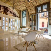
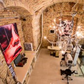
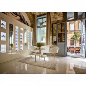
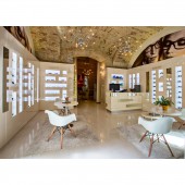
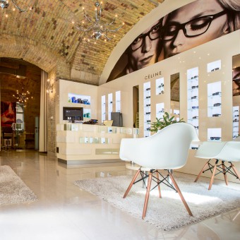
TC: I wanted to express the resonance of the surrounding's historical feeling through an original design combining old and new. My idea was to create a romantic but modern, contemporary design with the finest materials, simple forms and with beautiful illumination. My aim was not just to create a store for high end eyewears but an exclusive work of art.
FS: What are your future plans for this award winning design?
TC: My aim is always and in the future as well to make the optic stores popular by an unconventional design showing that it can be attractive, comfortable, modern and friendly.
FS: How long did it take you to design this particular concept?
TC: It took 27 days to design this concept.
FS: Why did you design this particular concept? Was this design commissioned or did you decide to pursuit an inspiration?
TC: This design was commissioned.
FS: Is your design being produced or used by another company, or do you plan to sell or lease the production rights or do you intent to produce your work yourself?
TC: My design is produced for this project.
FS: What made you design this particular type of work?
TC: My commission was to design an attractive optical store. As for the location of the store, it is in the city center of the capital in Hungary, in a narrow street with historical listed buildings around. The street has special athmosphere with restaurants, wine bar, coffee shop, ice cream parlour, clothing store, all in Italian style. The buildings of this street are newly renovated keeping all the important historical elements on the facades. Regarding the design I wanted to ensure this conception at Optika di Moda, leaving and highlighting the building's original 19th century features, inside and outside as well. My aim was to create a space combining old with the new in an elegant way. I wanted to make appeared all the old elements as much as I could due to it's listed status.
FS: Where there any other designs and/or designers that helped the influence the design of your work?
TC: I wanted to incorporate this space to the atmosphere of the surrounds. The historical background of the building additionally inspired me.
FS: Who is the target customer for his design?
TC: The owner of this eyewear store is from a famous optician dynasty. They sell luxurious high end eyewears. This store is a popular destination for sophisticated clients as well as local citizens accustomed to luxury and high quality treatments.
FS: What sets this design apart from other similar or resembling concepts?
TC: This retail space is situated in a listed building of a historic district. I wanted to make entering people be touched by the historical feeling.
FS: How did you come up with the name for this design? What does it mean?
TC: The name Optika di Moda means fashionable optic store combining the hungarian and italian words. It indicates that the space and the eyewear frames follow the trends. As a designer I wanted to keep the 19th century architectural features but with a trendy and contemporary design.
FS: Which design tools did you use when you were working on this project?
TC: I wanted to create luxurious athmosphere with a little cozy living room ambiance. My aim was to design an overall balance with combining diverse materials.
FS: What is the most unique aspect of your design?
TC: I incorporated a square glossy display cabinet which is a direct opposite of the arched brick walls. I experimented with matt and gloss finishes to lend a luxurious look to the space.
FS: Who did you collaborate with for this design? Did you work with people with technical / specialized skills?
TC: This kind of work required people with technical specialized skills in connection with the construction. It needed statical examination for the ceiling concerning to the chandeliers and ventilation facilities.
FS: What is the role of technology in this particular design?
TC: The plasterwork was completely removed to reveal the authentic arched brick ceilings. Then the walls underwent impregnation in order to strenghten and repair the sufaces for the future. Due to the limitations of working on a listed building, for the electric installation joints were removed in order to preserve the authentic bricks. I designed the display cabinets with a multi layered, high gloss paint finish. I prioritise not just nice but durable, resistant installation, so I choose the technology with responsibility.
FS: Is your design influenced by data or analytical research in any way? What kind of research did you conduct for making this design?
TC: The eyewear store is located in a neoclassical building. I was collecting the main characteristics of this era, when I realized that the building was built by Matyas Zitterbach, a member of an architectural family, active during the 18th century, and studied in Italy. I preserved the main traits in my design as the grandeur of scale and the simplicity of geometric forms. The renowned Hungarian composer Ferenc Liszt called this place home during the 1870s.
FS: What are some of the challenges you faced during the design/realization of your concept?
TC: The main challange was creating a contemporary vision for a luxury store while respecting and maintaining the original architecture and heritage of the property.
FS: How did you decide to submit your design to an international design competition?
TC: I like transforming things, giving beauty and value to a raw space. I like people who can dress the world in art.
FS: What did you learn or how did you improve yourself during the designing of this work?
TC: I improved myself by the historical details of the building.
FS: Thank you for providing us with this opportunity to interview you.
A' Design Award and Competitions grants rights to press members and bloggers to use parts of this interview. This interview is provided as it is; DesignPRWire and A' Design Award and Competitions cannot be held responsible for the answers given by participating designers.
| SOCIAL |
| + Add to Likes / Favorites | Send to My Email | Comment | View Press-Release | Translations |

