| THE AWARD |
| CATEGORIES |
| REGISTRATION |
| SUBMIT YOUR WORK |
| ENTRY INSTRUCTIONS |
| TERMS & CONDITIONS |
| PUBLICATIONS |
| DATES & FEES |
| METHODOLOGY |
| CONTACT |
| WINNERS |
| PRESS ROOM |
| GET INVOLVED |
| DESIGN PRIZE |
| DESIGN STORE |
| THE AWARD | JURY | CATEGORIES | REGISTRATION | PRESS | WINNERS | PUBLICATIONS | ENTRY INSTRUCTIONS |
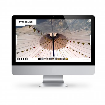
Eyesbound Portfolio Website by Julia Hell |
Home > Winners > Design #45698 >Interview |
 |
|
FS: What is the main principle, idea and inspiration behind your design?
JH: The Design aims for monochromatic simplicity to support the content.
FS: What has been your main focus in designing this work? Especially what did you want to achieve?
JH: I wanted to set a strong emphasis on the imagery and the design to be timeless and adaptive to the content.
FS: What are your future plans for this award winning design?
JH: Step by step developing it with some more features as well as developing more print solutions, like authenticity cards for buyers of the artworks and a catalogue.
FS: How long did it take you to design this particular concept?
JH: Designing it was a process of 3 weeks.
FS: Why did you design this particular concept? Was this design commissioned or did you decide to pursuit an inspiration?
JH: I was completely free in the design process. After the research period I decided, that the imagery has to be the key element which the design should wrap around.
FS: Is your design being produced or used by another company, or do you plan to sell or lease the production rights or do you intent to produce your work yourself?
JH: I keep on producing it myself.
FS: What made you design this particular type of work?
JH: It is one of my first web designs. When I was asked wether I would like to design the page, I thought it might be a nice way to gain experience in the web area.
FS: Where there any other designs and/or designers that helped the influence the design of your work?
JH: No, nothing in particular. Though I am strongly influenced by designers like Dieter Rahms or the Bauhaus era, where the reflection on essentials was significant for the design.
FS: Who is the target customer for his design?
JH: Photographers as well as people interested in Photography.
FS: What sets this design apart from other similar or resembling concepts?
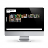
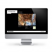
JH: The usage of the website is very intuitive. The focus lies on the artistic works of the photographer. The design is simple and easy to use, it works on an international level without translation into other languages.
FS: How did you come up with the name for this design? What does it mean?
JH: The name was given by my client. It stands for the necessity to keep your eyes open and to expect the next motive in everything.
FS: Which design tools did you use when you were working on this project?
JH: I designed the website in Adobe photoshop.
FS: What is the most unique aspect of your design?
JH: I had no restrictions designing the page, there was no other briefing than »I need a redesign for my website, can you do that?«. That was unique.
FS: Who did you collaborate with for this design? Did you work with people with technical / specialized skills?
JH: My client is also the programmer I worked with for the realization.
FS: What is the role of technology in this particular design?
JH: Technology plays a main role in this design. Since it is a website, it should be accessible through all devices and therefore needs to be responsive.
FS: Is your design influenced by data or analytical research in any way? What kind of research did you conduct for making this design?
JH: I went online and had a look at many websites with similar content. The design is the outcome of my personal analysis as a user. Some of the portfolio pages I visited were either complicated to use or somehow standard, like a tumblr. I wanted the monitor be the only frame / limitation instead of a container on the website.
FS: What are some of the challenges you faced during the design/realization of your concept?
JH: Image sizes online and loading them can be tricky and of course cross browser compatibility of some of the features is not given, because of lacking support by older browsers.
FS: How did you decide to submit your design to an international design competition?
JH: I received an e-mail by your Executive Account Manager, introducing the competition and that they saw my design and it might be a good idea to submit it.
FS: What did you learn or how did you improve yourself during the designing of this work?
JH: To stand behind your work.
FS: Thank you for providing us with this opportunity to interview you.
A' Design Award and Competitions grants rights to press members and bloggers to use parts of this interview. This interview is provided as it is; DesignPRWire and A' Design Award and Competitions cannot be held responsible for the answers given by participating designers.
| SOCIAL |
| + Add to Likes / Favorites | Send to My Email | Comment | View Press-Release |


