| THE AWARD |
| CATEGORIES |
| REGISTRATION |
| SUBMIT YOUR WORK |
| ENTRY INSTRUCTIONS |
| TERMS & CONDITIONS |
| PUBLICATIONS |
| DATES & FEES |
| METHODOLOGY |
| CONTACT |
| WINNERS |
| PRESS ROOM |
| GET INVOLVED |
| DESIGN PRIZE |
| DESIGN STORE |
| THE AWARD | JURY | CATEGORIES | REGISTRATION | PRESS | WINNERS | PUBLICATIONS | ENTRY INSTRUCTIONS |
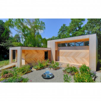
Fisher Studio Contemporary Building by Shawn Ewbank |
Home > Winners > Design #44451 >Interview |
 |
|
FS: What is the main principle, idea and inspiration behind your design?
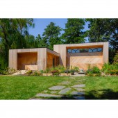
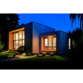
SE: This project was inspired by the client, Gary Fisher, who is a painter working in the style of abstract expressionism. For years, his studio was located in the cramped basement of a commercial building in Washington, D.C. – a space he shared with other artists. My vision was to create a building that was itself a piece of art and, that would arouse Mr. Fisher’s creative impulse toward the expansion of freedom, expression and subtle beauty - without intervening in his work. Another beautiful facet to Mr. Fisher is his love of gardening. The basic shape and massing of the building was conceived to create a courtyard through it’s relationship with the existing home while partitioning the large lot into distinct gardens. I really sought a building form that could be placed on site in relationship with the existing home and set as a sculpture within the gardens and courtyard it helped to create and Morgan Washburn did a fabulous job in turning these raw outdoor spaces into a quite beautiful park-like setting.
FS: What has been your main focus in designing this work? Especially what did you want to achieve?
SE: More directly, I wanted to provide a space that would not only function well pragmatically as a studio but also where he could expand the physical size of his paintings and experience an unencumbered sense of the freedom and phenomenon of space. For me, his paintings seem to conjure and play with spatial reality and I imagined that a higher quality of space and light might inform his process in a way that was not possible in the dank, soul-less basement he had been working in. Additionally, I wanted to ensure that the studio space could be transformed into a beautiful gallery where guests could also enjoy an uncommon experience of place while viewing Mr. Fisher’s latest paintings.
FS: What are your future plans for this award winning design?
SE: We will seek to have it published as widely as possible and look for new and exciting artwork from Gary Fisher!
FS: How long did it take you to design this particular concept?
SE: The full design process for this project took several months and navigated many different dynamics, as is always the case when designing a new building. The design that was built was actually the second of two designs. This particular concept came to life fairly quickly – probably in a matter of days (if not hours), followed by a lengthier period of design development with engineers and landscape designers.
FS: Why did you design this particular concept? Was this design commissioned or did you decide to pursuit an inspiration?
SE: Gary Fisher commissioned me to design a new artist studio after learning of my work through another project, the Zen House, which is also located in Rehoboth Beach.
FS: Is your design being produced or used by another company, or do you plan to sell or lease the production rights or do you intent to produce your work yourself?
SE: Not applicable for this design.
FS: What made you design this particular type of work?
SE: Not applicable for this design.
FS: Where there any other designs and/or designers that helped the influence the design of your work?
SE: Not applicable for this design.
FS: Who is the target customer for his design?
SE: Not applicable for this design.
FS: What sets this design apart from other similar or resembling concepts?
SE: That it exists, first of all, is an extraordinary thing. It is uncommon for a working artist to construct a 1700 studio and office next to their house. It is even rarer, in any context or scenario where a client is seeking a new building, for that client to commit the resources and adhere to the principles necessary to create a building of this type. The purity of form and quality of space and light in the Fisher Studio make it unique, not only among artist studios, but in residential architecture in general.
FS: How did you come up with the name for this design? What does it mean?
SE: Fisher Studio. Gary Fisher is the artist. This is the studio where he makes his paintings.
FS: Which design tools did you use when you were working on this project?
SE: Pencil, Paper, Autocad, Diplomacy, Understanding, Discipline, Creativity
FS: What is the most unique aspect of your design?
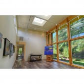
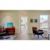
SE: There are many unique qualities here but probably the most apparent one is the basic, modernist/ organic form of the building. The building’s entrance is hidden among wraparound decks to encourage the sense of approaching a sculpture and the experience of discovery as one interacts with the architecture and gardens to gain entry. Inside, the main volume holds a separate storage and prep room and hosts the studio/gallery with very high ceiling and generous floor area, scaled so that large paintings can be created and also viewed from a distance sufficient to gain proper perspective. An open foyer connects the studio to a secondary volume, with lower ceiling, that holds the artist’s study, lounge and full bathroom.
FS: Who did you collaborate with for this design? Did you work with people with technical / specialized skills?
SE: My structural engineer on this project was Orndorf & Associates, located outside of Philadelphia. This is the second project where I’ve used them. Their work is impeccable and our relationship is such that we can work closely together to things right.
FS: What is the role of technology in this particular design?
SE: Technology was used throughout the design and build of the project. We had to understand and use the latest technology in order to create a design that was to become a sustainable building.
FS: Is your design influenced by data or analytical research in any way? What kind of research did you conduct for making this design?
SE: 16. Is your design influenced by data or analytical research in any way? What kind of research did you conduct for making this design? I focused my research on requirements related to use of space, critical lighting considerations, and sustainable design and energy usage. I began by engaging in a dialogue with the client about his art, process, and goals. Using a method called “problem seeking”, where solutions to unresolved problems of function are sought, I expanded the research phase to include information gleaned from observation of and conversation with other artists, manufacturers and specialists. This included on site testing and observation of proposed lighting solutions, documentary film and general internet research to reinforce and supplement insights gathered. Through that process, I determined that the building should function both as a studio for creating art and a gallery for exhibiting paintings and hosting receptions, concluding that the studio space would have a significant ceiling height and proportionate floor area so that large paintings could be created and exhibited in a way that allowed the viewer to stand at a distance and gain the proper perspective. Research made clear the benefit of an office and corresponding lounge space where the artist can reflect, conduct research, contemplate and relax, and a “prep room” to house significant storage for canvass and completed works not displayed in the gallery. Most interestingly, I learned that various styles of painting require differing qualities of light in which the artist should work. For abstract expressionism, the style in which Mr. Fisher paints, the ideal quality of light was determined to be what could be described as less-sharp or “delicately hazy”. To meet sustainability goals, I identified several strategies and concluded that the studio should function largely without artificial light during the day when possible. All necessary artificial lighting would be from LED sources, at the highest CRI (color rendering index) and medium color temperature of 3000K. Additional strategies derived from the research process included the use of solar panels, skylights, tankless hot water heater, waterless urinal in the bathroom, highly energy efficient windows, insulation that exceeds code requirements, low VOC paints, stains and adhesives, and an integrated fresh-air intake system. Following these insights, the studio/gallery has a ceiling height of sixteen feet covering a space that is proportioned to accommodate viewing large paintings and is expanded by a Northern wall of windows that affords views toward woods beyond. Perpendicular to the studio is a corresponding section with a lower ceiling height which houses the ancillary spaces. On most days the studio can function with no artificial light. The North facing window wall, domed acrylic skylights with translucent interior panels, and Southern clerestory windows, protected by a 4 foot eave, work in concert, as designed, to create the diaphanous quality of light crucial for an abstract painter. The high roof of the studio/gallery provides an elevated and flat surface for the 5.4 kW photovoltaic array. The rigid foam insulation, used to create drainage slopes on the flat roofs, increased the insulating factor of the roof assembly. The white, reflective TPO membrane roof surface reflects light in warm summer months, reducing energy loads on the building. All additional sustainability items listed above were implemented, reducing the building’s ecological impact.
FS: What are some of the challenges you faced during the design/realization of your concept?
SE: Without a doubt, budget was the biggest challenge here. The perception of simplicity in a piece of modern architecture belies the increased care and effort necessary to create it. Achieving clean forms in a building increases the complexity of construction and adds stress on the budget. After convincing the client to endorse a more extensive vision than was first imagined, the project proceeded through thoughtful, collaborative planning and detailing in order to achieve uncommon space within a reasonable budget. The project was ultimately realized with diligent coordination between architect, builder, manufacturers and suppliers.
FS: How did you decide to submit your design to an international design competition?
SE: Upon the studio’s completion, we all knew that it was something special. I felt a desire to share the work as broadly as possible and seeking recognition through awards and publication are the best way to reach a larger audience.
FS: What did you learn or how did you improve yourself during the designing of this work?
SE: With every project, I find that I become a better designer and architect. There are so many important dynamics that must be tended to when designing and there is no substitute in learning to navigate the waters of architectural design than the practice provided by a real-world project being built. Aside from the process and act of design, which is paramount, the most important things to learn are when to compromise and when to defend an idea or aspect of the design, how to communicate effectively with the client and with other members of the team helping to realize the project and how to mediate and resolve conflict. When I have done my job correctly, every aspect of a design has a reason and a purpose and I am able to understand the relative importance of each and to communicate that information when necessary.
FS: Any other things you would like to cover that have not been covered in these questions?
SE: This is the second new building of my career and I have made it a goal that I will not have a new building design built that does not include solar panels. I am 2 for 2 so far!
FS: Thank you for providing us with this opportunity to interview you.
A' Design Award and Competitions grants rights to press members and bloggers to use parts of this interview. This interview is provided as it is; DesignPRWire and A' Design Award and Competitions cannot be held responsible for the answers given by participating designers.
| SOCIAL |
| + Add to Likes / Favorites | Send to My Email | Comment | View Press-Release |

