| THE AWARD |
| CATEGORIES |
| REGISTRATION |
| SUBMIT YOUR WORK |
| ENTRY INSTRUCTIONS |
| TERMS & CONDITIONS |
| PUBLICATIONS |
| DATES & FEES |
| METHODOLOGY |
| CONTACT |
| WINNERS |
| PRESS ROOM |
| GET INVOLVED |
| DESIGN PRIZE |
| DESIGN STORE |
| THE AWARD | JURY | CATEGORIES | REGISTRATION | PRESS | WINNERS | PUBLICATIONS | ENTRY INSTRUCTIONS |
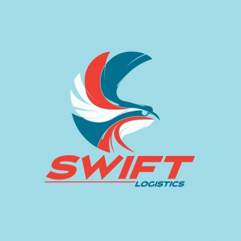
Swift Logistics Animation by Ben & Anvil |
Home > Winners > Design #43543 >Interview |
 |
|
FS: What is the main principle, idea and inspiration behind your design?
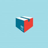
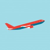
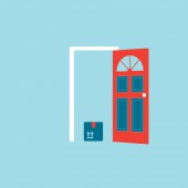
DC: The brief for this project was to create a short animation for a logistics company. The animation shows some of the different modes of transport and shipping that a logistics company would use. We see our package, which goes into a van, then onto an airplane and then is delivered to a house. The palette is limited to four bright colours, and these coloured shapes transform into each new image. These four colours then make up the company logo for the last scene. Our inspiration was the modernist use of a limited palette. It makes for a cohesive project and some innovative uses of colour. We kept to bright colours that were different to the colours of the actual items in reality. This helped to carry the idea that the images were symbols or icons, rather than graphical representations. This was to ensure that the logo did not look like a separate element to the animation, tacked on to the end as an afterthought. The palette ensured a running theme.
FS: What has been your main focus in designing this work? Especially what did you want to achieve?
DC: The most important aspect of this animation was to transmit the idea of a variety of shipping methods all working together to deliver a package. We wanted to show that each method was distinct but that it was one journey. The use of a limited palette and transforming one image into the next helped to carry the idea. Creating it with simple vector shapes that had similar styles in their angles and simplicity of design meant it was a very graphical look, with an illustrative quality.
FS: How long did it take you to design this particular concept?
DC: 40 hours from start of concept to the finished product.
FS: Which design tools did you use when you were working on this project?
DC: This was designed and completed using the Adobe Creative Suite, first in Illustrator and Photoshop, then composited in After Effects. The element of movement was important, to keep the symbols from looking static. This was to ensure that the viewer would continue to be interested, so we have a bounce or sway added to each element. It was essential to use an audio track that was upbeat and light, to help create a sense of fun.
FS: What are some of the challenges you faced during the design/realization of your concept?
DC: The hardest part of this design challenge was creating images that were equally similar in detail, so they looked like part of a set. Also we had to be creative in the placement of colour so that each element had equal proportions of the colours used, to further give the idea of a set. Then choosing how to break up each image and transform it into the next was difficult to keep it looking fresh. We started with a logo design and palette that worked, and moved from there to designing the others.
FS: Thank you for providing us with this opportunity to interview you.
A' Design Award and Competitions grants rights to press members and bloggers to use parts of this interview. This interview is provided as it is; DesignPRWire and A' Design Award and Competitions cannot be held responsible for the answers given by participating designers.
| SOCIAL |
| + Add to Likes / Favorites | Send to My Email | Comment | View Press-Release |


