| THE AWARD |
| CATEGORIES |
| REGISTRATION |
| SUBMIT YOUR WORK |
| ENTRY INSTRUCTIONS |
| TERMS & CONDITIONS |
| PUBLICATIONS |
| DATES & FEES |
| METHODOLOGY |
| CONTACT |
| WINNERS |
| PRESS ROOM |
| GET INVOLVED |
| DESIGN PRIZE |
| DESIGN STORE |
| THE AWARD | JURY | CATEGORIES | REGISTRATION | PRESS | WINNERS | PUBLICATIONS | ENTRY INSTRUCTIONS |
Kraft Foods Europe – The Wire Branding and Integrated Campaign by Taxi Studio |
Home > Winners > Design #25438 >Interview |
 |
|
FS: What is the main principle, idea and inspiration behind your design?
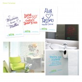
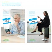
TS: The Brand design was influenced by the vernacular of social networks that are so familiar to everyone, but less so in the work environment for Kraft Food (Europe) marketers. The Kraft corporate branding is intentionally played down to avoid any corporate connotations… the Wire is an internal knowledge sharing platform for Maketers to engage with and to grow organically themselves, so it needed to feel like something they could own as well as feel approachable. “The Wire” was developed as the place to connect with new people in new ways. “Your line to fresh thinking” reminds KFE's marketers to plug in to the latest activity and break down conventional silos. The branding acts as a visual metaphor. It literally connects person A to person B. For the launch we uncovered a witty and genuine brand insight about KFE's brand marketers... they're a bit obsessive about their jobs! We translated this into a 'brand obsessive' campaign idea to 'tease' then explain the benefits of “The Wire” platform and make light of this unique, shared trait in KFE's brand marketer's DNA. Capturing our audience hook, line and sinker!
FS: What has been your main focus in designing this work? Especially what did you want to achieve?
TS: As the nature of the Wire is all about sharing inpirational best practice marketing, the intention was to develop a brand and campaign that was worthy of winning an award and indeed being a source of inspiration for the audience.
FS: What are your future plans for this award winning design?
TS: Work is currently being developed on a campaign to reignite KFE marketers and build on the initial success by increasing traffic and habitual usage of the site.
FS: How long did it take you to design this particular concept?
TS: The branding took about four weeks to develop whist the camapign took around 12 weeks from concept to roll out.
FS: Why did you design this particular concept? Was this design commissioned or did you decide to pursuit an inspiration?
TS: Taxi Studio were comissioned due to their experience of working on a number of Kraft Foods' brands as well as having worked extensively in the Interal Communications sector.
FS: Is your design being produced or used by another company, or do you plan to sell or lease the production rights or do you intent to produce your work yourself?
TS: The brand is being applied to the platform by another company, but it is expected that the evolution of the brand and capaign work will be upheld and developed by Taxi Studio
FS: Where there any other designs and/or designers that helped the influence the design of your work?
TS: A team of designers at Taxi Studio were assigned to the work both on the creative for the brand and for the campaign element. Each designer brings their own experience and influences through. No particular design influenced the end design, moreover the visual execution was informed by the brand name to create a fully integrated and harmonised solution.
FS: Who is the target customer for his design?
TS: Kraft Food Europe's 800+ marketers are the primary target audience although other employess who work in functions closely related to marketing also have some visibility of the brand via emailers. This takes the audience to around 1200 Kraft employees.
FS: How did you come up with the name for this design? What does it mean?
TS: The brand name needed to be easily understood and referred to across Kraft Food Europe's diverse marketing community. It was intended to create a brand that felt comfortable in the realm of social networks. "The Wire" sounds 'cool' – like something that can be tapped into – where you can gain insider knowledge.
FS: What is the role of technology in this particular design?
TS: The brand itself is for an online knowledge sharing platform that has all of the functionality that you would expect from a social media website. This is run on an internal intranet system. At the 'lo-fi' end of the scale, static acetate sheets were used for the ambient teaser graphics.
FS: Is your design influenced by data or analytical research in any way? What kind of research did you conduct for making this design?
TS: The campaign mechanic was centred around insights into the target audience.
FS: What are some of the challenges you faced during the design/realization of your concept?
TS: The greatest challenge was probably collating all of the campaign material into packs with clear instructions that then got shipped to each of the countries.
FS: How did you decide to submit your design to an international design competition?
TS: Our target audience was international in its make up , therefore it makes complete sense to submit the work for judging internationally. Of course, the kind of coverage and exposure that comes with an international competition also made it a very attractive proposition.
FS: Thank you for providing us with this opportunity to interview you.
A' Design Award and Competitions grants rights to press members and bloggers to use parts of this interview. This interview is provided as it is; DesignPRWire and A' Design Award and Competitions cannot be held responsible for the answers given by participating designers.
| SOCIAL |
| + Add to Likes / Favorites | Send to My Email | Comment | View Press-Release |


