| THE AWARD |
| CATEGORIES |
| REGISTRATION |
| SUBMIT YOUR WORK |
| ENTRY INSTRUCTIONS |
| TERMS & CONDITIONS |
| PUBLICATIONS |
| DATES & FEES |
| METHODOLOGY |
| CONTACT |
| WINNERS |
| PRESS ROOM |
| GET INVOLVED |
| DESIGN PRIZE |
| DESIGN STORE |
| THE AWARD | JURY | CATEGORIES | REGISTRATION | PRESS | WINNERS | PUBLICATIONS | ENTRY INSTRUCTIONS |
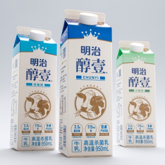
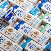
Chilled Milk Carton by Kazuo Fukushima |
Home > Winners > Design #150429 >Interview |
 |
|
FS: What is the main principle, idea and inspiration behind your design?
KF: The design is inspired by the harmony between high-quality dairy cows, sustainable farming practices, and nature. It emphasizes the premium quality of milk derived from well-cared-for cows.
FS: What has been your main focus in designing this work? Especially what did you want to achieve?
KF: The main focus was to convey premium quality and natural freshness in a way that resonates with consumers and distinguishes the product in a competitive market.
FS: What are your future plans for this award winning design?
KF: We plan to explore variations of the design for different product ranges while maintaining its core identity and expanding its reach in new markets.
FS: How long did it take you to design this particular concept?
KF: The concept took approximately four months, including research, ideation, prototyping, and finalizing.
FS: Why did you design this particular concept? Was this design commissioned or did you decide to pursuit an inspiration?
KF: This design was commissioned by Meiji to represent their brand ethos of premium quality and sustainability.
FS: Is your design being produced or used by another company, or do you plan to sell or lease the production rights or do you intent to produce your work yourself?
KF: The design is currently in use by Meiji for their chilled milk product line.
FS: What made you design this particular type of work?
KF: It was an opportunity to merge visual storytelling with functionality to highlight the premium nature of Meiji’s products.
FS: Where there any other designs and/or designers that helped the influence the design of your work?
KF: While I drew inspiration from traditional Japanese aesthetics and minimalism, the unique identity was crafted through my own creative process.
FS: Who is the target customer for his design?
KF: Health-conscious individuals who value premium quality and natural products, particularly in the Chinese market.
FS: What sets this design apart from other similar or resembling concepts?
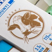
KF: The golden cow symbol and hand-drawn illustrations effectively communicate the product’s premium quality and natural origins, creating a standout visual identity.
FS: How did you come up with the name for this design? What does it mean?
KF: The design doesn’t have a specific name, but the golden cow symbol serves as its defining element, representing purity and quality.
FS: Which design tools did you use when you were working on this project?
KF: I used Adobe Illustrator and Photoshop for illustration and layout design, along with Procreate for initial sketches.
FS: What is the most unique aspect of your design?
KF: The golden cow mark at the center of the carton, symbolizing premium quality and drawing immediate attention on the shelf.
FS: Who did you collaborate with for this design? Did you work with people with technical / specialized skills?
KF: I collaborated with packaging engineers and printing specialists to ensure the design’s feasibility and quality.
FS: What is the role of technology in this particular design?
KF: Advanced printing techniques were used to achieve the matte finish and metallic gold highlights, adding a luxurious touch.
FS: Is your design influenced by data or analytical research in any way? What kind of research did you conduct for making this design?
KF: Yes, market research and consumer preferences in the Chinese dairy market influenced the design, focusing on premium and natural aesthetics.
FS: What are some of the challenges you faced during the design/realization of your concept?
KF: Balancing simplicity with a premium look while ensuring cultural relevance for the target market was a key challenge.
FS: How did you decide to submit your design to an international design competition?
KF: The unique combination of aesthetic appeal and functionality made it a strong contender for an international award.
FS: What did you learn or how did you improve yourself during the designing of this work?
KF: I honed my ability to translate brand values into a visually compelling and culturally relevant design.
FS: Any other things you would like to cover that have not been covered in these questions?
KF: This project reinforced the importance of collaboration between design, engineering, and market research to create successful products.
FS: Thank you for providing us with this opportunity to interview you.
A' Design Award and Competitions grants rights to press members and bloggers to use parts of this interview. This interview is provided as it is; DesignPRWire and A' Design Award and Competitions cannot be held responsible for the answers given by participating designers.
| SOCIAL |
| + Add to Likes / Favorites | Send to My Email | Comment | View Press-Release | Translations |


