| THE AWARD |
| CATEGORIES |
| REGISTRATION |
| SUBMIT YOUR WORK |
| ENTRY INSTRUCTIONS |
| TERMS & CONDITIONS |
| PUBLICATIONS |
| DATES & FEES |
| METHODOLOGY |
| CONTACT |
| WINNERS |
| PRESS ROOM |
| GET INVOLVED |
| DESIGN PRIZE |
| DESIGN STORE |
| THE AWARD | JURY | CATEGORIES | REGISTRATION | PRESS | WINNERS | PUBLICATIONS | ENTRY INSTRUCTIONS |
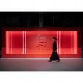
Red Wave Entrance by MURAYAMA INC. |
Home > Winners > Design #148376 >Interview |
 |
|
FS: What is the main principle, idea and inspiration behind your design?
MI: IGAS (International Graphic Arts Show) has always had a beautiful design for venue decoration. My challenge was to carry on the design of previous generations.
FS: What has been your main focus in designing this work? Especially what did you want to achieve?
MI: We researched and examined the design of the International Graphic Arts Show 2022 to preserve its brand. The annual entrance to the exhibition has a unique air about it, somehow unchanging despite its changing form. We focused our research on creating a continuous structure like the architecture of the Tokyo Big Sight: the venue of this event, and on integrating the conflicting shapes of straight and curved lines into a single form.
FS: What are your future plans for this award winning design?
MI: We want to connect the baton to the creation of better venues. We want to reaffirm the importance of exhibitions by making full use of both real and virtual spaces.
FS: How long did it take you to design this particular concept?
MI: The design work for this exhibition took approximately one and a half years.
FS: Why did you design this particular concept? Was this design commissioned or did you decide to pursuit an inspiration?
MI: At IGAS2015, there was a red world as sharp, clear, and transparent as crystal, created by overlapping layers of ink, but at IGAS2022, the layers of ink become a dynamic wave that welcomes and impresses visitors. This is how IGAS will protect its brand image.
FS: What made you design this particular type of work?
MI: The design needed to symbolize the enthusiasm of the exhibition, where lively business negotiations take place, without fear of stagnation caused by the Covid. The energetic red color and fluid form make it a reality.
FS: Where there any other designs and/or designers that helped the influence the design of your work?
MI: The design of this entrance is very simple, with straight lines at different angles, equally spaced. Japanese minimalism may exist in me.
FS: Who is the target customer for his design?
MI: People in the printing industry.
FS: What sets this design apart from other similar or resembling concepts?
MI: The fluid design facilitates the flow of people, reducing the stress of moving through crowded spaces and providing healing through beauty.
FS: How did you come up with the name for this design? What does it mean?
MI: What we imagined from the exhibition theme, "Venture into the innovation!" was that IGAS, where people's adventurous spirit intersects, is like an ocean, where visitors pass through great waves.
FS: Which design tools did you use when you were working on this project?
MI: Vectorworks and Adobe Creative Cloud
FS: What is the most unique aspect of your design?
MI: The point is that 2 conflicting elements coexist. The design of the entrance, combining straight and curved lines, gives the venue a dynamic and organic presence. I believe it is the power of design that can connect dissimilar things.
FS: Who did you collaborate with for this design? Did you work with people with technical / specialized skills?
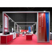
MI: We worked with people with specialized skills to complete all venue decorations. Such a design could never have been created by one person alone.
FS: What are some of the challenges you faced during the design/realization of your concept?
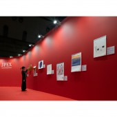
MI: We used a wrinkle-free fabric for striped molding which allows the graphic design to show through on both sides even printed on one side. The red colors are all slightly different and the lighting effects provide further color variation and movement. For the foundation of the molding, we used leased system products. The fabric served not only as decoration but also as a fixation for the foundation, minimizing the number of columns. This combines beauty with reduced environmental impact.
FS: How did you decide to submit your design to an international design competition?
MI: We would like more people to know about this design.
FS: What did you learn or how did you improve yourself during the designing of this work?
MI: I learned a lot about technical skills as a designer, communication with team members, project promotion, and exhibition branding.
FS: Any other things you would like to cover that have not been covered in these questions?
MI: MURAYAMA INC. is a team of professionals who create spaces and communications. Its services include planning, design, supervision, production, and construction of displays for promotion, branding, public relations, cultural / public projects, and entertainment. The creators' policy is to create unique spaces, weave unforgettable stories, and provide novel inspiration. Feeling inspired by the ever-changing world around them, they create novel experiences to inspire others. This has been their policy for 120 years. With finely honed skills and creative points of view, they seek to inspire in new and unique ways.
FS: Thank you for providing us with this opportunity to interview you.
A' Design Award and Competitions grants rights to press members and bloggers to use parts of this interview. This interview is provided as it is; DesignPRWire and A' Design Award and Competitions cannot be held responsible for the answers given by participating designers.
| SOCIAL |
| + Add to Likes / Favorites | Send to My Email | Comment | View Press-Release | Translations |


