| THE AWARD |
| CATEGORIES |
| REGISTRATION |
| SUBMIT YOUR WORK |
| ENTRY INSTRUCTIONS |
| TERMS & CONDITIONS |
| PUBLICATIONS |
| DATES & FEES |
| METHODOLOGY |
| CONTACT |
| WINNERS |
| PRESS ROOM |
| GET INVOLVED |
| DESIGN PRIZE |
| DESIGN STORE |
| THE AWARD | JURY | CATEGORIES | REGISTRATION | PRESS | WINNERS | PUBLICATIONS | ENTRY INSTRUCTIONS |
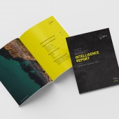
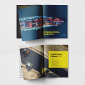
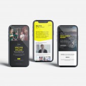
Bty Brand Identity Logo and Applications by Gonzalo Alatorre |
Home > Winners > Design #138763 >Interview |
 |
|
FS: What is the main principle, idea and inspiration behind your design?
GA: BTY’s new logomark is an analytical & mathematical interpretation of the moment a gennaker sail gets deployed. It is also inspired by the disruption that a gennaker sail brought to the sailboat racing world. This logomark represents the excitement of a more purposeful future, a future of people leading technology, not the other way around. A gennaker sail provides efficiency and speed. Maximum lift with minimum resistance. Gennaker sails were integral in the changes that allowed boats formerly racing at 35km/h to increase their speed upwards of 100 km/h. But just like artificial intelligence, without people making the right decisions while racing the boat, the boat’s newly acquired performance and speed would be without purpose.
FS: What has been your main focus in designing this work? Especially what did you want to achieve?
GA: Of all the things we do at Etude.Digital, nothing takes more work and is deceptively complex than what goes into designing a brand identity. In particular, a logo has so many values it needs to represent, and it needs to do so with radical simplicity. It takes a lot of work to communicate a clear set of values and vision in one stylized and straightforward idea. The following article is a statement of the work we did for our latest brand identity, which we undoubtedly think could be the best we have ever created. 1st Step - Actionable Intelligence Our goal is to understand thoroughly what our client does and be able to define it in a simple thought. This statement should describe beyond the services or products they sell; we need to understand what the client “ultimately” sells: BTY provides real intelligence to transform the built environment for people, the planet, and collective prosperity. In growing cities worldwide, BTY’s award-winning independent professional services push the built environment forward through viable projects that provide the foundation for thriving and sustainable communities. 2nd Step - Create a Brand Benchmark As a second step, we need to define a set of branding principles that will be our north star and benchmark by which we measure all efforts: BTY’s Brand Guiding Principles: In growing cities worldwide, BTY’s award-winning independent professional services push the built environment forward through viable projects that provide the foundation for thriving and sustainable communities by focusing on: The Future. With the exponential revolution that computing power and artificial intelligence are bringing to our lives, we need to ensure that all decisions shaping the communities of the future are rooted in: Real Intelligence. BTY takes a stand against artificial intelligence by understanding that it is a tool and not the end game. The critical decisions shaping humanity’s future will have to come from: Human Capital. BTY believes in people that act locally yet think globally. People that are hungry to make the world a better place and have the drive and intelligence to do so. BTY believes that its role in shaping the communities of the future is to serve as a: Catalyst. BTY understands its purpose to be an agent of progress and innovation by providing real intelligence to transform the built environment for people, the planet, and collective prosperity. Having established our guiding principles and strategic direction, we can begin the design process. Designing a brand identity without a clear strategy and guiding principles is like starting a trip without a plan or a map. It sounds like an exciting adventure, but most likely, it will take longer to get to where you want to go.
FS: What are your future plans for this award winning design?
GA: Our work for this project and winning design is just beginning. The new logo and brand identity got unveiled in January 2022; however, this rebrand intends to support our client's business objectives that are undergoing some fundamental operational changes that will disrupt their industry. Once these changes have been finalized, all brand touchpoints will be redone, with the design, marketing, and communication strategy centred around the company's new direction.
FS: How long did it take you to design this particular concept?
GA: Overall, the process took three to four months and hundreds of sketches in pencil and paper. However, my vision for this project was clear from the beginning as it stemmed from that position of actionable intelligence. It was just a matter of finding that one shape that clearly communicated our objectives.
FS: Why did you design this particular concept? Was this design commissioned or did you decide to pursuit an inspiration?
GA: We needed to develop a brand identity that would communicate across many cultures and languages. The design of the logo is a mathematical interpretation of a moment in time – when a gennaker sail gets deployed. It also needed to be easily reproducible across all mediums and printing techniques (litho or digital), making black the obvious choice and using a very vibrant yet standard yellow to help our client stand out in a market full of greys and blues.
FS: Is your design being produced or used by another company, or do you plan to sell or lease the production rights or do you intent to produce your work yourself?
GA: This design is the new brand identity for our client, BTY Group.
FS: What made you design this particular type of work?
GA: We needed to develop a brand identity that would communicate across many cultures and languages. The design of the logo is a mathematical interpretation of a moment in time – when a gennaker sail gets deployed. It also needed to be easily reproducible across all mediums and printing techniques (litho or digital), making black the obvious choice and supported by a very straightforward yet really vibrant yellow.
FS: Where there any other designs and/or designers that helped the influence the design of your work?
GA: For sure, we work as a team at Etude.Digital. Collaboration and being open to input are essential values we hold in our office. Yvonne Hsu worked closely with me in the development of this brand identity. Along with us, the rest of the team at Etude.Digital, Ben Regan, John Short, Gianfranco Valentini, and Katie Date were influential in the outcome of this project.
FS: Who is the target customer for his design?
GA: BTY Group is the trusted intelligence to meet investment objectives in real estate, infrastructure, and clean energy development. Their target audiences are local, state, and national governments and investors looking to invest in and develop large infrastructure projects changing communities worldwide.
FS: What sets this design apart from other similar or resembling concepts?
GA: The industry where BTY is competing is full f very conservative and safe brand identities. It is full of logos that are simply wordmarks and in pale blues and greys. Our client has historically done things differently by providing additional value to their services and making sure they provide progress at every stage of every project. We believe the BTY brand identity captures a message of excitement for things to come versus the more traditional approach of communicating a brand identity with values of risk-averse and safety.
FS: How did you come up with the name for this design? What does it mean?
GA: This is the name of the organization. It is based on the initials of the founders of the company.
FS: Which design tools did you use when you were working on this project?
GA: 90% of the work was done in pencil and paper. The rest was done in Adobe Creative Suite.
FS: What is the most unique aspect of your design?
GA: It is a very different take on what a logo should look like from a few different perspectives: it is a mathematical and analytical visual representation of a moment in time when a sail gets deployed.
FS: Who did you collaborate with for this design? Did you work with people with technical / specialized skills?
GA: Yvonne Hsu, one of our designers. Yvonne has the capacity to draw the thoughts that come to my head. Now that is a talent!
FS: What is the role of technology in this particular design?
GA: None other than the inspiration. The conception of the logo was done the old-fashioned way, in pencil. Afterwards, the design needed to be translated into the electronic medium, and it was fine-tuned there to make sure all proportions are correct, and all curves are natural curves.
FS: Is your design influenced by data or analytical research in any way? What kind of research did you conduct for making this design?
GA: No. It is influenced only by creativity.
FS: What are some of the challenges you faced during the design/realization of your concept?
GA: It took hundreds of iterations for us to arrive at a design that we felt was perfect. The challenge was also knowing when we were done when we had arrived.
FS: How did you decide to submit your design to an international design competition?
GA: We knew the quality was there as it was immediately adopted by the client, and it has been continuously praised by everyone who has seen it.
FS: What did you learn or how did you improve yourself during the designing of this work?
GA: I learned not to stop until that vision that I know is the perfect solution is achieved, regardless of the complexity of the outcome. In my head I was chasing this complex shape that needed to be simple at the same time. It wasn't easy!
FS: Thank you for providing us with this opportunity to interview you.
A' Design Award and Competitions grants rights to press members and bloggers to use parts of this interview. This interview is provided as it is; DesignPRWire and A' Design Award and Competitions cannot be held responsible for the answers given by participating designers.
| SOCIAL |
| + Add to Likes / Favorites | Send to My Email | Comment | View Press-Release |


