| THE AWARD |
| CATEGORIES |
| REGISTRATION |
| SUBMIT YOUR WORK |
| ENTRY INSTRUCTIONS |
| TERMS & CONDITIONS |
| PUBLICATIONS |
| DATES & FEES |
| METHODOLOGY |
| CONTACT |
| WINNERS |
| PRESS ROOM |
| GET INVOLVED |
| DESIGN PRIZE |
| DESIGN STORE |
| THE AWARD | JURY | CATEGORIES | REGISTRATION | PRESS | WINNERS | PUBLICATIONS | ENTRY INSTRUCTIONS |
No48 Fragrance Diffuser by Tatiana & Nicolas Boon |
Home > Winners > Design #128626 >Interview |
 |
|
FS: What is the main principle, idea and inspiration behind your design?
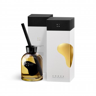
TB: The main inspiration is the synthesis of ambergris and yellow amber which has resulted in a delicate abstract form that evokes polished amber or a pebble found by the sea, breaking with the traditional image of ambergris. The shape has been carefully designed to evoke solid and liquid, land and sea. The chromatic choice of gold was obvious, embodying both the colour of amber and the symbolic value of ambergris. The minimalist typographic composition evokes the Zen garden and gives a feeling of lightness and relaxation. A subtle play of opposites and duality.
FS: What has been your main focus in designing this work? Especially what did you want to achieve?
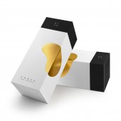
TB: We wanted to bring together two natural elements mysteriously linked by their names: ambergris, an animal raw material used in perfumery, and yellow amber, an ornamental resin named after the Arabic word "anbar", which means ambergris. We wanted the design to give a feeling of restful lightness and to be a play of opposites: earth/sea, solid/liquid, masculine/feminine, square/round, container/contained, black/white. We also wanted to find this duality in the side-by-side presentation of two packages that reconstitute the golden pebble in its entirety. The identity characterised by the choice of the number 48 reinforced this notion, thanks to the lettering where the square masculine 4 and the rounded feminine 8 complement each other. All these suggestive dualities subtly reinforce the balance between the elements.
FS: What are your future plans for this award winning design?
TB: As this was a limited edition order, there will be no follow-up to this project. However, we may launch a new limited edition in the near future.
FS: How long did it take you to design this particular concept?
TB: Between research, design and production we took two months for this work.
FS: Why did you design this particular concept? Was this design commissioned or did you decide to pursuit an inspiration?
TB: The client wanted to develop an ultra minimalistic graphic identity and fragrance diffuser. They gave us very few creative constraints to develop the brand, the packaging and the conceptual aspect which gave us the necessary creative freedom but was perhaps the most difficult part of the project.
FS: Is your design being produced or used by another company, or do you plan to sell or lease the production rights or do you intent to produce your work yourself?
TB: This project was produced and used by another company.
FS: What made you design this particular type of work?
TB: The intuition.
FS: Where there any other designs and/or designers that helped the influence the design of your work?
TB: No, but I must admit that the Japanese gardens inspired us for the layout.
FS: Who is the target customer for his design?
TB: This work targets a very wide audience. This product is intended for the interior and is therefore aimed at both companies and private customers.
FS: What sets this design apart from other similar or resembling concepts?
TB: I think that this concept stands out thanks to its minimalism, the absence of overkill and the strength of its suggestive, symbolic and metaphorical values.
FS: How did you come up with the name for this design? What does it mean?
TB: As a typographer, we were looking for a name whose meaning could unite the masculine and feminine. The number 48 was the ideal candidate, the masculine square 4 and the feminine rounded 8 complemented each other perfectly and made it possible to fit them both into a square when designing the typeface. It symbolically opposed masculine (square) and feminine (round) shapes.
FS: Which design tools did you use when you were working on this project?
TB: First we wrote down all the key words we wanted to evoke. Once the concept was defined we made a lot of drawings of the pebble to find the shape that would evoke both solid and liquid. The shape cut in two by the fold had to give the best balance on both sides of the box. The lettering and the typographic layout were designed with the same concern for balance and lightness. For the production files we worked with InDesign and Illustrator.
FS: What is the most unique aspect of your design?
TB: I think the unique aspect of design is the balance of the composition. Even if the duality is present for each element, it is the composition that gives it its refinement, like a Japanese garden where each element is in its place.
FS: Who did you collaborate with for this design? Did you work with people with technical / specialized skills?
TB: My wife and I work together, she contributed to the development of this work.
FS: What is the role of technology in this particular design?
TB: The technical difficulty of this project lay in the fact that the hot stamping had to be placed on the edge without the shape being damaged by the paper fold.
FS: Is your design influenced by data or analytical research in any way? What kind of research did you conduct for making this design?
TB: The analytical research focused mainly on the shape of the pebble, and the rounded forms that a liquid can adopt. The shape chosen had to evoke both the solid and the liquid, the earth and the sea, to bring together the two elements of our choice, amber (resin) and ambergris (animal product). Many drawings were useful before finding a shape that attracted the eye and had the necessary suggestive qualities.
FS: What are some of the challenges you faced during the design/realization of your concept?
TB: When working with very few graphic elements, as is the case with our packaging, the main challenges are the proportions of the elements between them and the balance of the composition. Nothing should be superfluous.
FS: How did you decide to submit your design to an international design competition?
TB: It was because of the many positive comments about the product that we decided to enter the international design competition. But it was my wife who took the decision and initiated the initiative.
FS: Thank you for providing us with this opportunity to interview you.
A' Design Award and Competitions grants rights to press members and bloggers to use parts of this interview. This interview is provided as it is; DesignPRWire and A' Design Award and Competitions cannot be held responsible for the answers given by participating designers.
| SOCIAL |
| + Add to Likes / Favorites | Send to My Email | Comment | View Press-Release | Translations |


