| THE AWARD |
| CATEGORIES |
| REGISTRATION |
| SUBMIT YOUR WORK |
| ENTRY INSTRUCTIONS |
| TERMS & CONDITIONS |
| PUBLICATIONS |
| DATES & FEES |
| METHODOLOGY |
| CONTACT |
| WINNERS |
| PRESS ROOM |
| GET INVOLVED |
| DESIGN PRIZE |
| DESIGN STORE |
| THE AWARD | JURY | CATEGORIES | REGISTRATION | PRESS | WINNERS | PUBLICATIONS | ENTRY INSTRUCTIONS |
Yuchuan Ming Tea Tin Cans by Jessica Zhengjia Hu |
Home > Winners > Design #121072 >Interview |
 |
|
FS: What is the main principle, idea and inspiration behind your design?
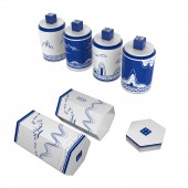
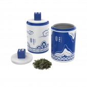
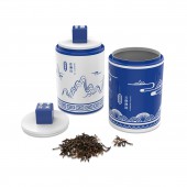
JH: This project is a series of Blue-and-white tin cans for tea packaging. The main decorations on the sides are mountain and cloud figures resembling the style of Chinese ink wash landscape paintings. By combining traditional patterns with modern graphic elements, abstract lines and geometric shapes are blended into traditional art styles, providing refreshing features for the cans. The tea names in traditional Chinese “Xiaozhuan” calligraphy are made into embossed seals on top of the lid handles. They are the highlights which make the cans more like artworks in some way.
FS: What has been your main focus in designing this work? Especially what did you want to achieve?
JH: Designing practical, functional, and artistic tea packaging is my basic purpose. But I am also seeking answers for these questions, “How to blend modern elements into traditional cultures smoothly? How to interpret traditional styles in more creative and appealing ways? How to build up relationships and connections between the past and the future? And finally how to transform these ideas into reality so people can get the essence and beauty of the tea, porcelain, ink wash painting, and modern graphic design from the products at the same time.”
FS: What are your future plans for this award winning design?
JH: I hope there could be chances to launch these products into the market.
FS: How long did it take you to design this particular concept?
JH: About one and a half month.
FS: Why did you design this particular concept? Was this design commissioned or did you decide to pursuit an inspiration?
JH: As native Cantonese, tea drinking is a daily routine of my family. One day I saw a small Blue-and-white porcelain cup while I was trying to make some tea. The inspiration popped up and I thought it would be a good idea to design tea cans which had a Blue-and-white porcelain-liked appearance. They would still be tin cans, but using only blue and white colors and somehow resembling Chinese ink wash painting styles. The purpose is to mimic the look of Blue-and-white porcelain, so the cans can be used as decorative containers or art pieces as well.
FS: Is your design being produced or used by another company, or do you plan to sell or lease the production rights or do you intent to produce your work yourself?
JH: This design is an in-house project for my own design studio. It has not been produced or used yet. However, I do wish there could be opportunities to launch them into the market, maybe by leasing the production rights or collaborations.
FS: What made you design this particular type of work?
JH: As a native Cantonese, I grew up under deep influence of the Cantonese Kongfu Tea. Tea drinking is a daily routine of my family. Chinese Tea Culture has a history of thousands of years. As a young generation tea drinker, I want to inherit this tea culture and interpret it in new innovative ways.
FS: Where there any other designs and/or designers that helped the influence the design of your work?
JH: I am inspired and deeply impressed by Chinese ancient traditional blue-and-white porcelains and ink wash paintings.
FS: Who is the target customer for his design?
JH: Tea drinkers and art lovers.
FS: What sets this design apart from other similar or resembling concepts?
JH: How to draw customer attention when there are so many selections of the same type of tea products in the market? A classy and attractive package may help a lot in this way. Imitating a Blue-and-white porcelain-liked surface adds deluxe features to the external appearance of the tin cans. In addition, the landscape figures and traditional pattern decorations on the sides emphasize the artistic value of the cans. And the highlight is the traditional “Xiaozhuan” calligraphy embossed seal on top of the lid handle. This style of seal is frequently used in actual Chinese ink wash paintings and artworks by many traditional artists. Therefore the embossed seals make these tin cans more like real artworks when presenting to the customers. In China, tea is usually associated with art events and cultures. And I hope people can enjoy the beauty within all these Chinese traditional art cultures while relishing the mellow taste of Chinese tea.
FS: How did you come up with the name for this design? What does it mean?
JH: Yuchuan is an alternative name of tea originated from the Song Dynasty in Chinese history. It is said that a scholar in Song Dynasty once compared tea to a friend called “Mr Yuchuan” in his book. The name “Yuchuan” has passed on since then. And the word “Ming” means tea as well. So I combined the two words and came up with the project name.
FS: Which design tools did you use when you were working on this project?
JH: I used Adobe Illustrator and Photoshop to design the graphic images and patterns. I built the 3D product models with Solidworks. For retouching and rendering, I use 3D Max or Cinema 4D.
FS: What is the most unique aspect of your design?
JH: In this project, the major designs are tin cans with blue and white colors and features resembling the Chinese traditional ink wash painting of landscapes. On top of the lid handles are embossed seals of the name of each tea. These seals are made of “Xiaozhuan”, a traditional calligraphy style from the Qin Dynasty. The major landscape images on the sides are mountains and clouds. With the ideas that tea grows in the mountains, and clouds express the peaceful and relaxing feelings that tea brings us. Traditional Chinese patterns and modern graphic elements are blended into the concept of ink wash painting. With abstract lines and geometric shapes, modern elements combine with traditional Chinese art styles, providing refreshing features for the packaging works. In addition to the tin cans, hexagonal outer boxes are designed under the same concept features and methods. The outer boxes are a set of external packages for the tin cans as well.
FS: Who did you collaborate with for this design? Did you work with people with technical / specialized skills?
JH: I design them myself.
FS: What is the role of technology in this particular design?
JH: The 3D modeling software and technology largely improve the effectiveness and efficiency of the design and mockup testing process.
FS: Is your design influenced by data or analytical research in any way? What kind of research did you conduct for making this design?
JH: My researches are mostly about historical and cultural backgrounds. I went through category of different types of Chinese tea and selected four popular ones as representatives for my projects: the “West Lake Longjing”, “Tie Guanyin” which is a type of Oolong tea, the “Biluochun” and the “Puer Tea”. Then I had to associate their origin, tastes and qualities with the shapes and features of ink wash landscape paintings. In addition, I also looked for interesting tea traditions and stories in Chinese history for inspirations.
FS: What are some of the challenges you faced during the design/realization of your concept?
JH: The challenge of this project is the interaction between traditional art forms and modern creative styles. Combining different forms of traditional cultures is my first attempt. The important part is to make balance between all these art cultures so they will not be separated or taking over each other.
FS: How did you decide to submit your design to an international design competition?
JH: Instead of working for a company or being a freelance designer, I finally founded my own design studio in China this year. The “Yuchuan Ming” project is the first official project of my new No.72 Design Studio. I believed taking the advantage of this great opportunity to challenge the A Design competition would be a good starting point for the studio and a big breakthrough for myself as a designer.
FS: What did you learn or how did you improve yourself during the designing of this work?
JH: After making several mistakes, my 3D modeling skill got practiced and improved during the product developing progress. And I kept learning new skills and techniques in each projects.
FS: Any other things you would like to cover that have not been covered in these questions?
JH: If we want to improve, we should never be afraid of exploring new methods or making mistakes.
FS: Thank you for providing us with this opportunity to interview you.
A' Design Award and Competitions grants rights to press members and bloggers to use parts of this interview. This interview is provided as it is; DesignPRWire and A' Design Award and Competitions cannot be held responsible for the answers given by participating designers.
| SOCIAL |
| + Add to Likes / Favorites | Send to My Email | Comment | View Press-Release | Translations |


