| THE AWARD |
| CATEGORIES |
| REGISTRATION |
| SUBMIT YOUR WORK |
| ENTRY INSTRUCTIONS |
| TERMS & CONDITIONS |
| PUBLICATIONS |
| DATES & FEES |
| METHODOLOGY |
| CONTACT |
| WINNERS |
| PRESS ROOM |
| GET INVOLVED |
| DESIGN PRIZE |
| DESIGN STORE |
| THE AWARD | JURY | CATEGORIES | REGISTRATION | PRESS | WINNERS | PUBLICATIONS | ENTRY INSTRUCTIONS |
Typotect Corporate Identity by Seulah Choi |
Home > Winners > Design #104366 >Interview |
 |
|
FS: What is the main principle, idea and inspiration behind your design?
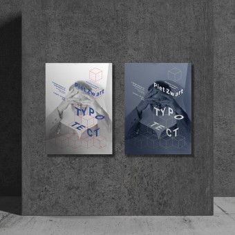
SC: Piet Zwart, who was an architect and also a typography designer is the main principle and also the inspiration. I first knew him in a communication design class and got a chance to research more about him I thought his works were very fundamental and it could be the standard and the base of the modern design. That was why and how I chose him as my inspiration.
FS: What has been your main focus in designing this work? Especially what did you want to achieve?
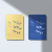
SC: I always try to make story and logic in the design. For example, Piet Zwart used linear shapes and 3 primary colors and also made space into the basic shapes. Those characteristics were actually my research output and I try to put them into the graphic. This was how the main graphic theme like square type and line type were used in the poster and other design applications. This process is, for me, making a logic of the design and identity, and also putting story into it. Communicating and delivering the message is my main point of doing design so logically thinking and making up the story into it is what I aim for and what I always want to achieve.
FS: What are your future plans for this award winning design?
SC: I'm currently working as a designer in Seoul, but I aim to do some other creative activities.
FS: How long did it take you to design this particular concept?
SC: The project started in 2016 when I was studying graphic design in New Jersey, USA. From research to making brand identity was done in that year. Logic and story based identity, like logo and color usage was done but I need to research more about museums because I felt like the museum branding I did need something different from other modern museums. I developed it in 2017, when I came back to South Korea and started to variate it. At this moment, color scheme changed because the previous one seemed like too much. Due to my graduation exhibition, 2017 and 2018 was so busy to make a development. I restart it on 2019-2020 while making my portfolio and finally I could put everything I intended. It took few years but I think I was actually trying hard to make it better and better every year.
FS: Why did you design this particular concept? Was this design commissioned or did you decide to pursuit an inspiration?
SC: It was started in the class but I developed it as a professional work to show other people about Piet Zwart.
FS: Is your design being produced or used by another company, or do you plan to sell or lease the production rights or do you intent to produce your work yourself?
SC: I just did it for myself, not for other reasons. It's a concept design of new modern museum about Piet Zwart.
FS: What made you design this particular type of work?
SC: Absolutely, Piet Zwart's works. When I first saw his pieces, I realized why people calls him as a pioneer of modernism. He has that base and standard of modern graphic design, and I think it's because of he worked as an architect and typography designer. It made me interesting and thought it could inspire many designers if there's a museum about modernism with a certain person like Piet Zwart.
FS: Where there any other designs and/or designers that helped the influence the design of your work?
SC: Piet Zwart himself, and also all the art museums in New York and New Jersey.
FS: Who is the target customer for his design?
SC: Everyone could be the target especially art and design major people.
FS: What sets this design apart from other similar or resembling concepts?
SC: Logic and story in the work.
FS: How did you come up with the name for this design? What does it mean?
SC: It came up from Piet Zwart's career. He was an architect and also a typography designer. TYPOTECT is a mixed word from his career.
FS: Which design tools did you use when you were working on this project?
SC: Adobe programs were used such as Illustrator and photoshop.
FS: What is the most unique aspect of your design?
SC: It has meanings and thoughts in every part of details. It is basically a 'logic' and a 'story'.
FS: Who did you collaborate with for this design? Did you work with people with technical / specialized skills?
SC: I did it by myself, but did talked a lot about Piet Zwart with classmates.
FS: What is the role of technology in this particular design?
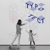
SC: I actually planned some interactive design in the museum so I thought blocks I used for graphic can be shown on the wall or on the table so kids can enjoy some interactive activity in the museum.
FS: Is your design influenced by data or analytical research in any way? What kind of research did you conduct for making this design?
SC: Yes, definitely. I firstly research his works, and gather the image together. This process was how I find out 3 characteristics of his works which is linear, 3 primary color and making space into a shape. After that, I've been to a lots of art museums in New York city to see the identity was shown to people.
FS: What are some of the challenges you faced during the design/realization of your concept?
SC: Reinterpreting his works were a bit challenging because he has his own type of graphic style and it was hard to focus on his work and also make new graphic style from original ones.
FS: How did you decide to submit your design to an international design competition?
SC: Piet Zwart is not as popular as other modernism designer in my country. Even though my works are neatly done, I thought it might be harder to persuade people from my country. That's why I decided to submit this work to global award which other different country people can understand and read the message.
FS: What did you learn or how did you improve yourself during the designing of this work?
SC: I learned making my works into communication works, like, how to reorganize it to make others understand my work easily.
FS: Any other things you would like to cover that have not been covered in these questions?
SC: It is always challenging designer new things. I hope this could inspire me to go to next level.
FS: Thank you for providing us with this opportunity to interview you.
A' Design Award and Competitions grants rights to press members and bloggers to use parts of this interview. This interview is provided as it is; DesignPRWire and A' Design Award and Competitions cannot be held responsible for the answers given by participating designers.
| SOCIAL |
| + Add to Likes / Favorites | Send to My Email | Comment | View Press-Release |


