Harry's Newsstand Pop-up Shop at Grand Central by Harry's |
Home > Winners > #46483 |
 |
|
||||
| DESIGN DETAILS | |||||
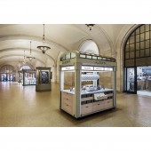
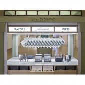
| DESIGN NAME: Harry's Newsstand PRIMARY FUNCTION: Pop-up Shop at Grand Central INSPIRATION: When conceptualizing the space, we chose to pay homage to Grand Central's heralded past by drawing inspiration from classic 1920's and 30's news stalls. We've added our own modern aesthetic in a thoughtful, complimentary way, so the Newsstand blends seamlessly into the backdrop of Grand Central Terminal. UNIQUE PROPERTIES / PROJECT DESCRIPTION: As an e-commerce business, we celebrate the opportunity to provide physical touch-points for our customers and the community. This holiday season, we created a short-term retail experience that show-cased both our grooming products and brand. The space was located in the historic Grand Central Terminal, in mid-town Manhattan. Through considered design, material selection, and custom printed collateral, the Newsstand was a beautiful point of interaction for daily commuters, tourists and shoppers. OPERATION / FLOW / INTERACTION: Our Newsstand was free standing and designed to attract commuters, tourists, and shoppers. To attract these guests and to compliment our Newsstand, we designed and printed our own newspaper for daily commuters to enjoy on their train rides. The paper has custom content created by our in house editorial team. To celebrate the holiday season and give nod to Grand Central's past, we also created a printed map of the terminal that doubles as wrapping paper. The map is illustrated by R. Kikuo Johnson. PROJECT DURATION AND LOCATION: The project started in October 2015 and ended in January 2016. Our Newsstand stood in New York City's Grand Central Terminal for the duration of the project. FITS BEST INTO CATEGORY: Interior Space and Exhibition Design |
PRODUCTION / REALIZATION TECHNOLOGY: We used a combination of carrara white marble, white oak, dimensional lettering, and frosted glass with vinyl lettering to achieve our intended aesthetic. Pull-out shelving and backlit lighting added additional functionality to our Newsstand. SPECIFICATIONS / TECHNICAL PROPERTIES: Our Newsstand's stood 2413 mm wide, 1422.4 mm deep, and 2653.3 mm tall. TAGS: industrial design, start-up, shaving, grooming RESEARCH ABSTRACT: Harry's was founded with one simple purpose: To make getting ready better, for everyone, every day. We started by making our own products at the highest standard; product customers would be proud to use. Our razor blades are engineered in Germany at our own factory, which has been manufacturing some of the world’s finest blades for almost 100 years. Our handles are designed with clean lines that emphasize their utility. Our face products are formulated using natural ingredients to protect the face during the shave and moisturize throughout the day. Our hope is that Harry's can make shaving more enjoyable for people, making them feel prepared to take on the day. As such, this activation provided an opportunity to reach a local set of customers during their commute; a time when morning routines and preparedness are still top-of-mind. We found this activation to be a valuable tool in exposing more people to our brand, and used incentive cards as an opportunity to test and drive redemption back to our own website. CHALLENGE: Within the Newsstand, we sold all of our goods including our full line of shave products and our other grooming accessories. Designing our Newsstand in such a way that attracted customers, represented our modern brand, yet still blended seamlessly into the backdrop of Grand Central's historic terminal was a creative challenge we embraced throughout the duration of the project. ADDED DATE: 2016-02-25 19:08:58 TEAM MEMBERS (7) : Scott Newlin, Frank Zaremba, Tim Boyle, Ryan Dougherty, Elsa Chiao, Brandon Nickerson and Garrett Morin IMAGE CREDITS: We worked with the supremely talented architecture photographer, Dean Kaufman, to shoot all Newsstand photos. His images accurately capture all the sentiments we wished to express through the design of the space. |
||||
| Visit the following page to learn more: http://www.harrys.com | |||||
| AWARD DETAILS | |
 |
Harry's Newsstand Pop-Up Shop At Grand Central by Harry's is Winner in Interior Space and Exhibition Design Category, 2015 - 2016.· Press Members: Login or Register to request an exclusive interview with Harry's. · Click here to register inorder to view the profile and other works by Harry's. |
| SOCIAL |
| + Add to Likes / Favorites | Send to My Email | Comment | Testimonials | View Press-Release | Press Kit |


