Seasonal Greetings Art Collection Season's Greetings Cards by ir F. A. la Rivière |
Home > Winners > #75774 |
 |
|
||||
| DESIGN DETAILS | |||||
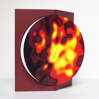
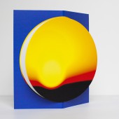
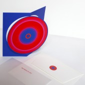
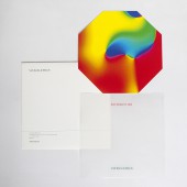
| DESIGN NAME: Seasonal Greetings Art Collection PRIMARY FUNCTION: Season's Greetings Cards INSPIRATION: The design concept of this series of New Years season's Greetings cards is lasting relationships. Each year a small piece of art, is send out by the client’s company as a token of gratitude for a lasting relation with the recipient. The quality of the card is such that the recipient will want to keep it. For the image side the colourful abstract artwork by the photographer Tim Porter is used and guarantees that the artistic content is of high quality. In 2015 and 2016 a unique octagonal shaped card and for the following years a stand-up card was developed. Printed on high quality paper invites to display the card over a long time. Hence underlining the idea of lasting relationships. Already continued over several years’, recipients have by now created a small art collection, as is the idea of the project. To allow for a personal touch the “Greetings sheet” printed on heavy weight transparent paper is meant for writing messages to customers and for signing. Separating this function from the card is also meant to entice recipients to keep the card. The set consists of a purpose designed envelop with tear strip, a greetings sheet on transparent paper and the art-card. UNIQUE PROPERTIES / PROJECT DESCRIPTION: From its inception five years ago, the features that remained are the size of the card to fit with in a dimension of 150 x 150 mm, the envelope with tear-off strip and the transparent wishing sheet on which personal messages can be written so that the actual card stays pristine. The design features a unique way to make the circular shape of the artwork stand-up. Inspired on paper art folding and cutting techniques were used to achieve the card. Folding dimples allow for the circular cut-out to protrude from its background. In order to reproduce the vivid colours of the original artworks special inks are used. In addition, an extra layer of varnish is applied to further enhance the saturation of the colours of the image. OPERATION / FLOW / INTERACTION: In the first year, a card with an octagonal shape was developed as a unique geometric shape sufficiently contrasting with the circle of the artwork. For the recent cards a stand-up version was designed. By folding backwards, the background a three-dimensional shape appears. The circular shape is freed from its background. PROJECT DURATION AND LOCATION: The project was initiated in 2015 and is now in its 5th year. FITS BEST INTO CATEGORY: Graphics, Illustration and Visual Communication Design |
PRODUCTION / REALIZATION TECHNOLOGY: Off-set printing. Envelope: Takeo Vasonubo V White 104 kg Card:Takeo Vasonubo V White 163 kg With gloss varnish on image area. Greetings sheet: Transparent paper. In addition to the printed card, an electronic version was also designed. SPECIFICATIONS / TECHNICAL PROPERTIES: Dimensions: envelope 159 x 154 mm, transparent greeting sheet 150 x 150 mm, card 150 x 150 mm. Envelope: Takeo Vasonubo V White 104 kg Card:Takeo Vasonubo V White 163 kg With gloss varnish on image area. Greetings sheet: Transparent paper. The envelope has a strip of adhesive tape for sealing and a tear-off strip of ease of opening the envelop. TAGS: seasons, greetings, new year, card, envelope, wishes, vivid colours RESEARCH ABSTRACT: The design research consisted of formal variance and colour studies, as well as printing technical studies. Test prints and mock-ups were produced in order to study and evaluate the effects of the colour combinations between the artwork and the background as well as the shape of the card. In particular the study to make the circular shape stand up, so the recipients could have the card on their desk, was a particular field of study. CHALLENGE: The greatest design challenge was to come up with a way to make the circular shape of the artwork stand-up. Several solutions were studied and discussed with the client and the printers. The final version has folding dimples and the circular cut-out produced in one action by means of a cutting stamp. In order to reproduce the vivid colours of the original artworks special inks are used. Furthermore to the image area an extra layer of varnish is applied that further saturates the colours. ADDED DATE: 2019-02-08 13:12:47 TEAM MEMBERS (2) : ir F. A. la Rivière, Frank la Rivière Architects inc and Tim Porter, Photographer IMAGE CREDITS: ir F. A. la Rivière, Frank la Rivière Architects inc PATENTS/COPYRIGHTS: Copyrights belong to Tim Porter (Artwork) ir F. A. la Rivière (Graphic Design and card design) |
||||
| Visit the following page to learn more: http://www.frank-la-riviere.com | |||||
| AWARD DETAILS | |
 |
Seasonal Greetings Art Collection Season's Greetings Cards by Ir F. a. La Rivière is Winner in Graphics, Illustration and Visual Communication Design Category, 2018 - 2019.· Press Members: Login or Register to request an exclusive interview with ir F. A. la Rivière. · Click here to register inorder to view the profile and other works by ir F. A. la Rivière. |
| SOCIAL |
| + Add to Likes / Favorites | Send to My Email | Comment | Testimonials | View Press-Release | Press Kit |


