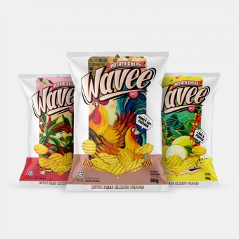
Wavee Packaging Identity by Shawn Goh Chin Siang

Home > Winners > #73465


DESIGN DETAILS
DESIGN NAME:
Wavee

PRIMARY FUNCTION:
Packaging Identity

INSPIRATION:
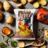
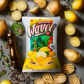
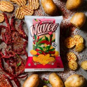
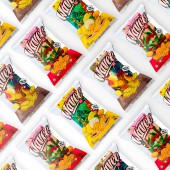
The potato chips is one of the most favored snacks worldwide. As Wavee potato chips is a new brand, we decided to use illustrated packaging as a means to bring out the brand’s identity and the product’s features. Various themes and colors are implemented to differentiate between the flavors while maintaining the same brand identity and elements. We want to create a vibrant, beautifully illustrated design with bright, jazzy colors that appeals to the consumers on the chip aisle.

UNIQUE PROPERTIES / PROJECT DESCRIPTION:
The main selling point of Wavee Potato Chips is non-fried, which addresses the need of the new generation who have become more health conscious. By creating a fun, vibrantly illustrated packaging design, our goal is to create a lasting impression of Wavee in order to build up a strong, recognizable brand image as a healthier choice of potato chips. Also, the white blank frame on the package helps unifying the brand’s identity and makes it distinguishable from other similar products.

OPERATION / FLOW / INTERACTION:
Potato chips are our all time favorite. There are so many brands in the potato chips industry, ranking from low to high end. We can also see various design for potato chips packaging. Therefore, it is important that we emphasize on its non-fried technology and create a brand identity using iconic packaging design in order to distinguish Wavee from the other products. Our objective is to create an image of fun, delicious and healthy snack.

PROJECT DURATION AND LOCATION:
The project began in March 2018 and the food market began in June 2018 More than 30 countries including China, Indonesia, Thailand, Philippines, Cambodia, Singapore, Japan, Korea, Australia, India, Pakistan, Saudi Arabia, United Arab Emirates, Jordan, Iraq, Algeria, Chile, Costa Rica, Maldives and Mauritius

FITS BEST INTO CATEGORY:
Packaging Design

PRODUCTION / REALIZATION TECHNOLOGY:
This bag uses a registered matte material.

SPECIFICATIONS / TECHNICAL PROPERTIES:
175mm  x  245mm

TAGS:
Wavee, Potato Chips, Malaysia, Packaging Design, Branding.

RESEARCH ABSTRACT:
Our market research found out that most of the potato chips in the market are fried chips. However, we also found out that people are becoming more health conscious so our mission is to produce a healthier, non-fried product. As each potato chips brand in the market has its own unique packaging style, we realize we need something that makes our brand and product stands out from the rest a fun, colorful, beautifully illustrated packaging.

CHALLENGE:
The biggest challenge of this project is to create a beautiful packaging that brings out the flavors of the chips. At the same time, we have to also emphasize on the non-fried technology that makes it a healthier choice. Since Wavee is a new brand, it is also very challenging to create a brand identity and packaging design that stands out from the current potato chips companies.

ADDED DATE:
2018-12-22 02:54:06

TEAM MEMBERS (3) :
Art Director : Shawn Goh Chin Siang, Copywriter : Joann Yeong Chai Wei and Photography : Pierre Pang Chin Sing

IMAGE CREDITS:
Image #1 : Shawn Goh graphic design lab.
Image #2 : Shawn Goh graphic design lab.
Image #3 : Shawn Goh graphic design lab.
Image #4 : Shawn Goh graphic design lab.
Image #5 : Shawn Goh graphic design lab.

PATENTS/COPYRIGHTS:
Copyright ©2018 Shawn Goh Graphic Design Lab. All rights reserved.

Visit the following page to learn more: https://www.behance.net/gallery/69949943/Wave e-Potato-Chips


CLIENT/STUDIO/BRAND DETAILS
NAME:
SKS Food Industries (M) Sdn. Bhd.

PROFILE:
SKS Food Industries (M) Sdn. Bhd. is one of the largest and oldest food manufacturers in Malaysia. With over 40 years of expertise in food manufacturing, SKS Food exports its product to over 30 countries in the world. Its quality brands and products include OMYPOP’s popcorn, Mister Coco’s coconut cookies, Wavee's non-fried popped potato chips and many more. SKS Food applies the international recognized HACCP (Hazard Analysis and Critical Control Point) system to ensure food safety. It is also ISO 22000 and Halal certified.


NOMINATION DETAILS

Wavee Packaging Identity by Shawn Goh Chin Siang is a Nominee in Packaging Design Category.

· This project is currently confidential as results have not been announced yet. Images and further details of the project is not available for public yet, please check back later. If you are the owner of this design, please login to view the images.

· Click here to register today inorder to be able to view the profile and other works by Shawn Goh Chin Siang when results are announced.


AWARD DETAILS

Wavee Packaging Identity by Shawn Goh Chin Siang is Winner in Packaging Design Category, 2018 - 2019.


· Press Members: Login or Register to request an exclusive interview with Shawn Goh Chin Siang.

· Click here to register inorder to view the profile and other works by Shawn Goh Chin Siang.


SOCIAL
+ Add to Likes / Favorites | Send to My Email | Submit Comment | Comment | Testimonials | View Press-Release | Press Kit


COMMENTS
Giulia Esposito Comment #8322 on December 26, 2022, 9:47 am
I am thrilled to see the amazing work of "Wavee". The packaging identity of this product is truly unique, creative, and eye-catching. The colors and shapes used on the label seamlessly blend together, creating a visually stunning effect. The overall design is modern and elegant, making it stand out from other products on the shelf. It is a great example of how creativity and innovation can come together to create something beautiful. It is certainly a work to be proud of and a worthy recipient of the A' Design Award. Congratulations to Shawn Goh Chin Siang for their success!
Adam Harris Comment #58322 on January 3, 2023, 9:16 pm
I am in awe of the creativity and innovation behind this award-winning work! The illustrated packaging design perfectly captures the essence of Wavee Potato Chips and is able to differentiate the flavors with its unique theme and colors. It is particularly impressive how the design is able to emphasize the product's healthier, non-fried feature without compromising the vibrant, fun look. This is a great example of how good design can create a lasting impression and help build a strong brand image. Congratulations to the designer for this amazing work!
Chloe Turner Comment #66804 on January 4, 2023, 1:10 am
I am so impressed by the innovative design of Wavee potato chips! The illustrations are bright and vibrant, and the range of themes and colors used to differentiate between the flavors is clever and very effective in creating a memorable brand identity. It's clear that a lot of thought has gone into the design, and the result is a beautifully illustrated product that is sure to stand out on the chip aisle. Well done to the designer of Wavee potato chips for creating such an eye-catching and memorable design!
Mark Allen Comment #68033 on January 4, 2023, 1:45 am
This award-winning packaging design is truly remarkable and stands out from the rest. It is apparent that much research and thought has gone into creating a distinct brand identity and packaging design that is vibrant, fun, and emphasizes the product's non-fried technology. The beautiful illustrations and bright colors are sure to create a lasting impression and help build a strong, recognizable brand image. Congratulations on the success of this project!
Elisabeth Clark Comment #69380 on January 4, 2023, 2:24 am
I'm absolutely in awe of Shawn Goh Chin Siang's award-winning work - "Wavee" - as it really stands out from the rest. The vibrant colours and illustrations provide an eye-catching, fun element to the packaging, while the white blank frame helps give the design a consistent and distinct identity. It's clear that a lot of research went into creating a healthier and more appealing potato chip brand - and this packaging identity really reflects that. It's no wonder that this design has been recognised with the prestigious A' Design Award - it's a great example of good design in action!

Did you like Shawn Goh Chin Siang's Packaging Design?
You will most likely enjoy other award winning packaging design as well.
Click here to view more Award Winning Packaging Design.


Did you like Wavee Packaging Identity? Help us create a global awareness for good packaging design worldwide. Show your support for Shawn Goh Chin Siang, the creator of great packaging design by gifting them a nomination ticket so that we could promote more of their great packaging design works.

See other A' Design Award and Competition WinnersA' Design Award Presentation Submit Your Designs
 
design award logo

BENEFITS
THE DESIGN PRIZE
WINNERS SERVICES
PR CAMPAIGN
PRESS RELEASE
MEDIA CAMPAIGNS
AWARD TROPHY
AWARD CERTIFICATE
AWARD WINNER LOGO
PRIME DESIGN MARK
BUY & SELL DESIGN
DESIGN BUSINESS NETWORK
AWARD SUPPLEMENT

METHODOLOGY
DESIGN AWARD JURY
PRELIMINARY SCORE
VOTING SYSTEM
EVALUATION CRITERIA
METHODOLOGY
BENEFITS FOR WINNERS
PRIVACY POLICY
ELIGIBILITY
FEEDBACK
WINNERS' MANUAL
PROOF OF CREATION
WINNER KIT CONTENTS
FAIR JUDGING
AWARD YEARBOOK
AWARD GALA NIGHT
AWARD EXHIBITION

MAKING AN ENTRY
ENTRY INSTRUCTIONS
REGISTRATION
ALL CATEGORIES

FEES & DATES
FURTHER FEES POLICY
MAKING A PAYMENT
PAYMENT METHODS
DATES & FEES

TRENDS & REPORTS
DESIGN TRENDS
DESIGNER REPORTS
DESIGNER PROFILES
DESIGN INTERVIEWS

ABOUT
THE AWARD
AWARD IN NUMBERS
HOMEPAGE
AWARD WINNING DESIGNS
DESIGNER OF THE YEAR
MUSEUM OF DESIGN
PRIME CLUBS
SITEMAP
RESOURCE

RANKINGS
DESIGNER RANKINGS
WORLD DESIGN RANKINGS
DESIGN CLASSIFICATIONS
POPULAR DESIGNERS

CORPORATE
GET INVOLVED
SPONSOR AN AWARD
BENEFITS FOR SPONSORS
IMPRESSUM IMPRINT

PRESS
DOWNLOADS
PRESS-KITS
PRESS PORTAL
LIST OF WINNERS
PUBLICATIONS
RANKINGS
CALL FOR ENTRIES
RESULTS ANNOUNCEMENT

CONTACT US
CONTACT US
GET SUPPORT

Good design deserves great recognition.
A' Design Award & Competition.