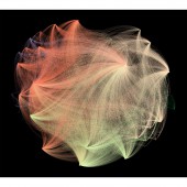
A Stranger to Words Data Visualization by Meng Chih Chiang |
Home > Winners > #41557 |
 |
|
||||
| DESIGN DETAILS | |||||
| DESIGN NAME: A Stranger to Words PRIMARY FUNCTION: Data Visualization INSPIRATION: As an English dyslexic, Meng Chih Chiang explores the relationship between language and the people who has language-based learning disabilities. By recording thousands of daily words for about one year, Meng rendered a huge individual data set to make invisible reading progress visible and to reveal the novel perspectives of learning a second language in the experimental interface. She wishes to transform the suffering of depression and frustration to a fantastic and imaginative production. UNIQUE PROPERTIES / PROJECT DESCRIPTION: ‘A Stranger to Words’ is an interactive network graph created by Meng Chih Chiang to visualize her personal learning experience. Based on her daily reading report, the personal database of 23,358 words were created originally to express how she understood words. Its goal is to reveal a connecting system of underlying text algorithm in a novel and insightful way and to unfold personal sentiments as a dyslexic through the capabilities of data visualization. OPERATION / FLOW / INTERACTION: Interpretation── The graph consists of 4,525 nodes and 17,648 edges. Each word has four properties of English learning: 1. Known / Unknown 2. Letter length 3. Syllable length 4. Frequency of occurrence For example, the word “People” will connect to the node of “Known” (I knew the word), the node of “Occurrence 3” (It appeared 3 times totally), the node of “Length 8” (8 letters) and the node of “Syllable 2”. The size of a node in the graph is determined by the number of nodes/words to which it is connected, with bigger circle indicating more connections. Interaction── 1. Zoom in to enlarge the network to see words clearly. 2. Roll over any node of word, it will show 4 line of their properties. 3. Roll over the node of property, it will show all the words which own this trait. PROJECT DURATION AND LOCATION: The data is recorded in 2013 and the project is created during 2014 to 2015. |
PRODUCTION / REALIZATION TECHNOLOGY: The data was processed by Excel programming at first, generating particular ID and assigned serial number to words. Then the layout of the huge data set was preprocessed using the Gephi visualization platform and rendered with the JavaScript library sigma.js using Dreamweaver. User Interface were designed by Photoshop and Illustrator, which also created a large text poster. The final documentary video is finished with After Effects for post-production and narrative animation. SPECIFICATIONS / TECHNICAL PROPERTIES: 1920 x 1080 pixel screen resolution. The larger, the better. TAGS: Experiment, Education, Minimal, Data visualization, Infographics, Text, Words, Language RESEARCH ABSTRACT: Sapir-Whorf hypothesis held that the structure of a language affects the perceptions of reality of its speakers and thus influences their thought patterns and world views. The perspective of language is not only a text performance, but also a treatment how the speaker reflects their family, language and culture mentality. By analyzing the language, it provides possibly new insights of Meng' learning experience, and reveals new perspectives on English reading. CHALLENGE: The main challenge is to make a personal text dataset instead of downloading other existing one. Not only have I had to record all the words for a long period of time, but also generated the data using Excel programming to display the logic and mathematic thinking. It’s a crucial process decided the visualization of shape, color and project spirit. ADDED DATE: 2015-06-18 16:38:58 TEAM MEMBERS (1) : IMAGE CREDITS: Image #1, #2, #3, #4: Creator Meng Chih Chiang, A Stranger to Words, 2014 Video Credits: Creator Meng Chih Chiang, Score Composer Tzu-Ho Lin |
||||
| Visit the following page to learn more: http://www.astrangertowords.com | |||||
| AWARD DETAILS | |
 |
A Stranger to Words Data Visualization by Meng Chih Chiang is Winner in Graphics, Illustration and Visual Communication Design Category, 2015 - 2016.· Press Members: Login or Register to request an exclusive interview with Meng Chih Chiang. · Click here to register inorder to view the profile and other works by Meng Chih Chiang. |
| SOCIAL |
| + Add to Likes / Favorites | Send to My Email | Comment | Testimonials | View Press-Release | Press Kit |


